

How Do I Design A Kick-Ass Logo? Secrets From Our Design Team
Posted in: Innovation
A unique, carefully crafted logo is a powerful tool. It helps connect people to your brand, your products and even your overall mission as a company.
In fact, your company logo is often the lasting image that many people are left with when they interact with your business, and it’s the first thing that pops in their head when your brand is mentioned. Even young kids who can’t spell or write can correctly identify well-known logos out of a lineup and associate them with the company they belong to.
But the craft of creating a perfectly executed logo is a lot more difficult than it sounds – it’s an art form all in its own. The best kinds of logos find a way to instantly relate a product or business to customers all in one simple image. For example, when you spot Nike’s signature “swoosh,” you can’t help but think of their sweet kicks or their “just do it” attitude. When you see the classic Apple logo, you immediately picture their modern, clean designs and their inspiring creative culture that follows the same principles.
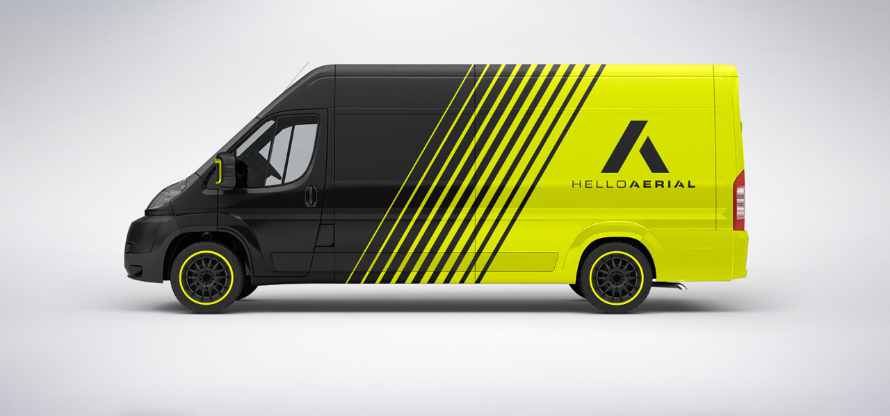
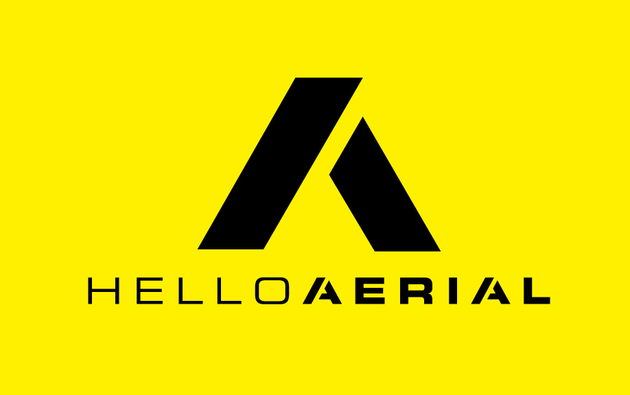
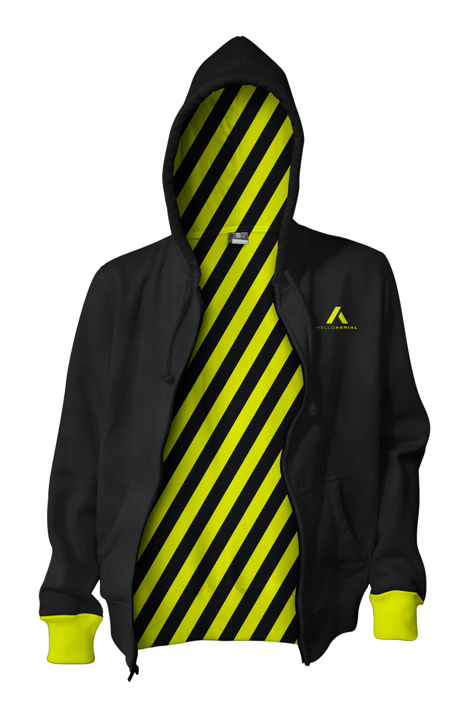
Luckily, our design team at Hello Innovation is top-notch when it comes to logo design. In fact, they recently finished creating a stunning logo and brand design for our Hello Aerial business, so they are fresh full of tips for creating a logo that kicks ass and stands out from the crowd. Here are a few of the design secrets they shared for creating the perfect company logo.
1. Find the meaning and “why” of the company
Because a company’s logo is the front face of the brand and every creation that comes out of it, it is important that the logo is the living embodiment of the brand in every single way. “You can come up with cool designs all day long, but does it actually serve the purpose of the brand?” our Director of Design, Vorrel Prendergast, prompted. Your starting point when designing a new logo should begin with the purpose of the company and deciding how your logo can visually connect with your audience and bring that purpose to life.
One of the best ways to do this is to fully understand the brand’s essence. What is their vision of success? What is their greater purpose? How do they want to be perceived? What core values do they live by? Let the brand strategy direct your efforts and stay true to it when creating your logo.
2. Decide which type of logo you want to create
There are actually several different types of logo designs. There is a logotype, which is using a unique font to display your company’s name and letting that stand as the logo. There is a logo mark, which is when your company’s name is paired with a unique image to help people further identify the company. Last, there is a symbol logo, where a company fully represents itself with an image. (Think Nike, Apple or Starbucks.)
However, which type of logo you decide on will depend on the nature of your company. For instance, while many people would like to use one bold, iconic image to define their brand, a great deal of advertising and notoriety must first be done in order to create the association between the image and your brand. If you are able to find a unique font for your logo or create custom lettering, you may be able to simply use a logotype, such as Coca-Cola and Ray-Ban do. However, if you have a generic company name that may not be able to hold its own with a wordmark, you may want to create a logo mark to accompany your name. It’s important to weigh the pros and cons of each of these logo types and decide which will be most appropriate for your brand.

3. Be unique
In many different types of art, imitation is considered the sincerest form of flattery. Not in logo design. Sure, you can be inspired by other artist’s unique designs and creations. However, it’s important to set your company’s logo apart from the others and think out-of-the-box when it comes to design. For instance, if you work in the dental industry, it may be tempting to simply use a tooth in your logo and call it a day. However, everyone in that field does the same thing. You want to do something totally different.
And while your logo should easily showcase your brand’s identity on first glance, it should also provide something deeper and more meaningful on second glance. For instance, in the dental industry, you want to convey the feeling of health, cleanliness and care in your image, but it should not be overtly obvious with images of toothbrushes everywhere. Use color, design and shapes to convey the feelings you want to suggest instead. For instance, while our Hello Aerial logo incorporates the brand’s initials on the surface, the design is also reminiscent of an arrow that points up, to signify the upward movement of our aerial drone products.
4. Be timeless and simple
With many aspect of designs, it’s tempting to look at the different styles that are trending in the design industry and try to follow along those lines. However, your company logo should not be something that you want to change every year to keep up with the trends. Instead, it should stand the test of time and give your audience the same feeling 5, 10 or even 20 years down the road.
Your design itself should also avoid being overly complex or showy. After all, you want people be able to read it as they zip past your store in their car, or while quickly looking through the pages of a magazine. It should jump out to them by being simple, yet creative.
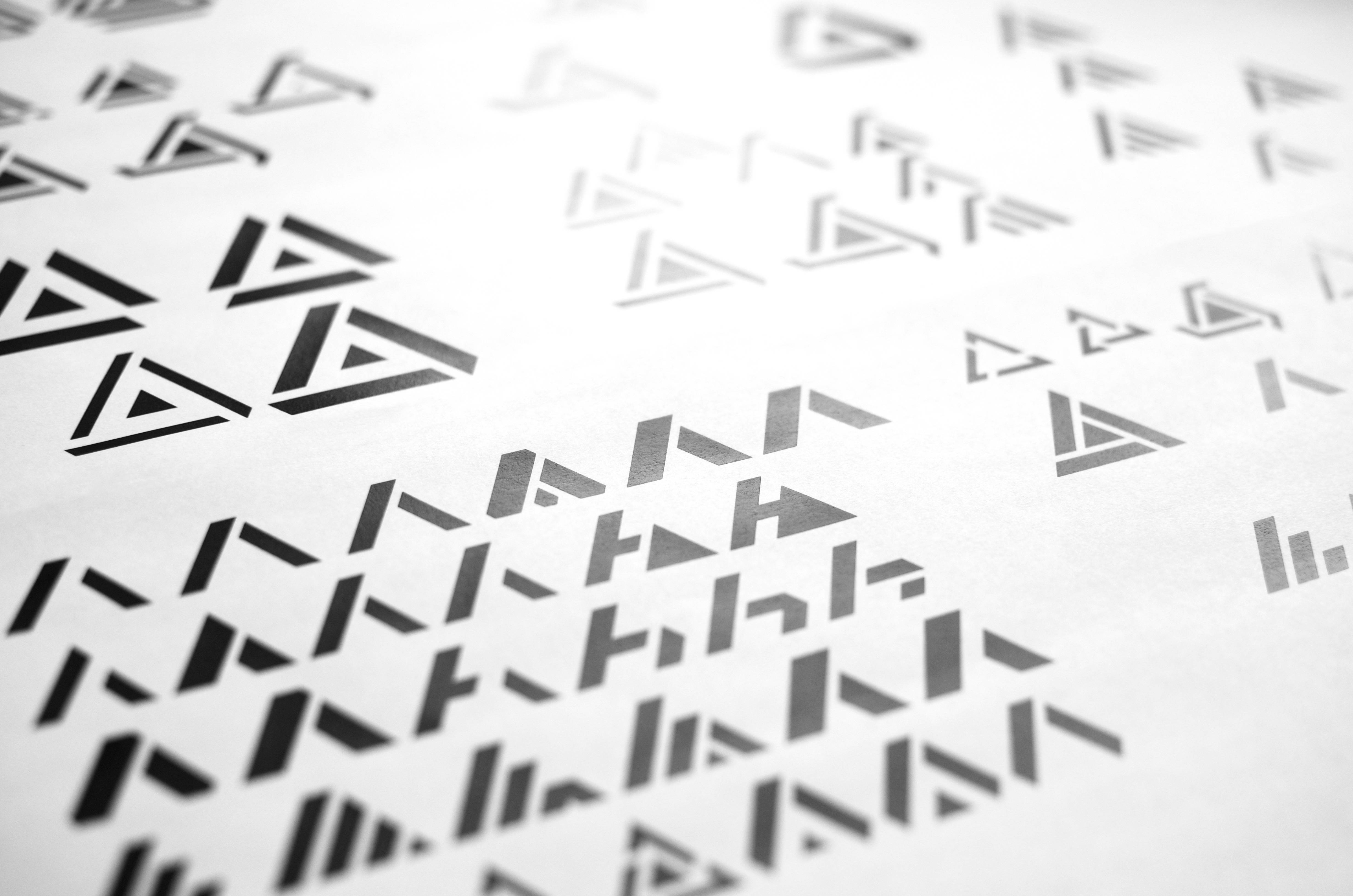
“One of the best ways to see if your logo is going be strong and stand out is to try it in black and white,” Prendergast said. “If it doesn’t work in black and white, it doesn’t matter how much color you put into it. It’s not going to work. Once it works well in black and white, then you can add color to it and enhance it.”
5. Use appropriate colors
Speaking of adding color to your logo design, it is important to do a color study and make sure you are using certain colors in the right context. For instance, you typically do not want to design a child’s toy in a mix of black and red colors, as they are usually seen as powerful, strong, fierce colors. Instead, you want to do something that conveys happiness, fun and playfulness, such as yellow, light blue or pink.
At the same time, you also want to ensure that the color you are using in your logo will hold up throughout all of your future marketing efforts. Will five colors be too expensive to produce on business cards or stationery? Will the image that looks sharp on your computer screen bleed together in newspaper or magazine ads? Can you replicate the colors in your merchandise? Be sure to test your logo in many different situations to ensure that you are creating a color scheme for all purposes.
6. Think socially
In addition to thinking about the different ways in which your color may look in printing, it’s also important to consider how your logo will look in different forms of digital media. After all, nearly every brand is now on Facebook, Twitter or LinkedIn, so how will their logo translate to these social profiles? You need to create a design that goes far beyond the limits of paper and looks great in icons, apps and profile pictures.
7. Use negative space as part of your design
While many people often think about the many elements of color, shape or images they can add to a logo in order to enhance it, it also sometimes helps to think about what you can take away from an image in order to make it unique. Take this FedEx logo, for example:
![]()
The designer of this logo utilized negative space in a cool way in order to create a hidden arrow in the text. (Can you see it?) Sometimes it’s not so much what you can add to a logo in order to make it unique, but what you can take away from it, as well. Check out Logopond to see more awesome examples of negative space used in logo design.
8. Walk away from your design
Once you have finally created a logo you are proud of and that properly conveys your brand’s message, walk away from it. That’s right, leave it alone, come back the next day and see if you still like it just as much. “When you create something that is truly great, each time you come back to it, it will just get better and better,” Prendergast said.
“Also, if there is something that you really, really love, whether it’s a design you come up with in the inspiration phase, or even deep into the exploration phase, move on and try something different.” Here at Hello Innovation, we are constantly trying to explore different ideas throughout our design process so that we can see all ends of the spectrum. This means exploring every single idea, from A - Z, whether it’s something traditional or WAY out there. By doing so, we can fully explore our brand. During this process, we also often typically uncover different elements that may better work together to create the perfect brand.
No matter what, never settle during the creative process; keep pushing yourself and pushing yourself until you create something that is truly memorable.
What are some of the best company logos you have ever seen? Be sure to share them with us in the comments below! Or, if you are a designer yourself, be sure to share your best tips for creating an amazing logo design!


4 comments